Introduction:
Imagine making a critical business decision with hundreds of rows of numbers in front of you. Data visualization in data engineering turns this overwhelming information into clear, meaningful patterns that guide decision-making. In today’s data-driven world, visualization is not just a skill—it’s a necessity for engineers, analysts, and leaders. In this article, you’ll discover why visualization is essential, how to select the right tools, and where to find trusted learning resources to sharpen your skills.
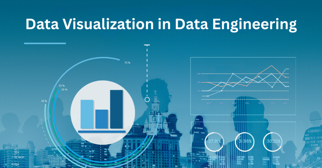
Importance of Data Visualization in Data Engineering
Data visualization in data engineering bridges the gap between raw numbers and business strategy. It helps identify trends, detect anomalies, and communicate insights across teams. For example, a logistics company can track delivery performance in real time using dashboards, saving time and money. Visualization empowers professionals to see what matters most, reducing guesswork and enabling faster, data-backed decisions.
Why the Right Tools Matter
Choosing the right visualization tools can completely change outcomes. Platforms like Microsoft Power BI, Tableau, and Looker allow engineers to create interactive dashboards that scale globally. These tools integrate with cloud computing solutions, making them perfect for anyone pursuing a cloud computing online course or a data engineering course. For learners, taking a cloud computing online course or Power BI training is an excellent start.
How to Find the Right Expert Support
A qualified instructor or mentor can make complex concepts easier to grasp. Searching for “best data engineering course near me” or enrolling in Global Teq’s Azure Data Engineering Course ensures you get expert guidance with real-world projects.
Where to Get Reliable Learning Resources
Authentic, trusted platforms are key for staying current with industry trends. Global providers like Global Teq offer online training worldwide, helping professionals upgrade skills from anywhere. You can also explore high-authority sites like Tableau Public for free visualization examples.
Final Thoughts: Turning Data into Decisions
Data visualization in data engineering is about transforming complexity into clarity. By learning and applying the right techniques, you can unlock hidden patterns and create powerful business insights. Explore our data analytics course to start building job-ready visualization skills today, or contact us to learn more.
FAQs
What is data visualization in data engineering?
It is the process of turning raw data into graphical formats like charts and dashboards to simplify insights.
Why is data visualization important for businesses?
It helps businesses identify trends, make data-driven decisions, and communicate findings effectively.
Which tools are best for data visualization?
Microsoft Power BI, Tableau, and Looker are some of the most popular tools for professionals.
Can beginners learn data visualization easily?
Yes, with structured training like Global Teq’s online data engineering course, beginners can quickly gain practical skills.
Where can I learn data visualization online?
You can explore Global Teq’s Microsoft Power BI Training for hands-on learning and real-world projects.


